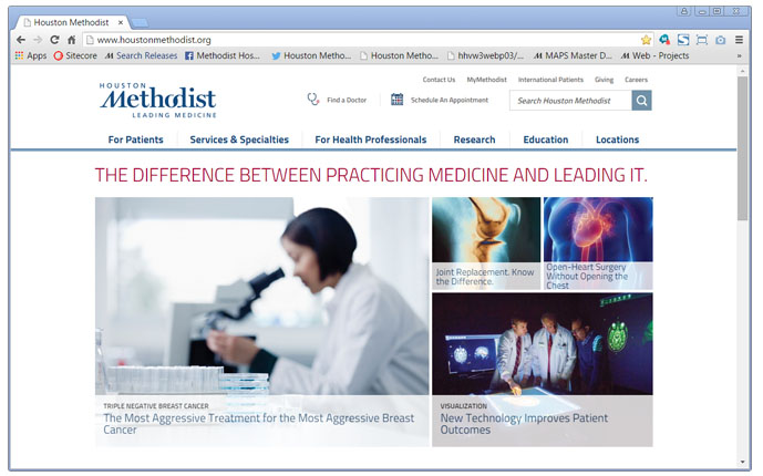
New external website. Easier for patients. Better professional collaboration.
Clear categories and clickable icons. Now it’s easier for patients to find what they’re looking for.
It also simplifies the search for healthcare professionals wanting to refer a patient, collaborate on research initiatives or participate in continuing education.

Market research-driven redesign.
We wanted to ensure a new website would make sense to patients and healthcare professionals. So we asked them to let us know how we could improve.
Nearly 1,000 gave us their opinions, including 100 in-person experiences and nearly 900 survey responses.
They told us the old website could present navigation challenges, and let us know how we could highlight Houston Methodist as a consistently high-ranked academic medical center. Using that feedback, we got to work redesigning the site.
Patient-friendly.
Enhanced navigation improves the patient experience, from initial information-gathering about available services to easier online bill payment.
One click leads patients to a landing page with links to disease-specific patient education, geographically diverse support groups, insurance information, travel and accommodation details for out-of-town patients and more.
It also provides easily seen regional and international contact numbers for patients who prefer a phone conversation.
Enhancing professional collaboration.
A single click leads healthcare professionals to patient referral resources, credentialing and continuing education and research opportunities. Physicians, researchers, pharmacists, nurses and allied health professionals can easily find information specific to their disciplines and interests.
